
Redesigning a 15 Year Old Florist Website
Can you imagine going to the mesh conference and being embarrassed about your website?
Can you imagine being a sponsor of mesh and being embarrassed about your website?
That is how we felt at Florist One. It’s not that our website was terrible, it was just dated,like 1999 type of dated. And we literally mean our website was from 1999.
We were proud of the fact we were one of the first florists online, we were feeling pretty good that we had and API that let our affiliate partners build a flower storefront on any website or application, and that we had moved our website and API to Amazon EC2 cloud computing – but it was 2014 and we still had a 15 year old website!
Our original 1999 website was simple, clutter free, and it converted sales fantastically well and this was a big part of the slow move to something more modern. We did a “Redesign” which was a cool, modern looking website – we just could not get our Redesign to convert visitors to sales as well as ‘1999’. Well, we finally did succeed in getting our ‘Redesign’ to convert better than ‘1999’ and here is the story of that process.
The Origin of Redesign and Rollout Considerations
We wanted to see a lot of possible designs for our new website and we turned to 99 Designs . 99 Designs let us specify our price and design needs and then a marketplace was created where many, many designers submitted designs. So many designs were created it was a bit overwhelming to choose one, but taking the time to go through them was worth it. We felt a bit bad turning down quite a few good designs, but we picked a winner and it was something we were happy with.
We had to be sure that the Redesign was actually better for sales. We have an Affiliate Program where our partners (also called affiliates) send us traffic and get a commission on sales – any mistakes on the sales conversion front would hurt our partners and our business. Before we could roll out Redesign on traffic from our partners, we rolled it out to a few select pages of our own traffic where we could use analytics to do A/B Testing. We thought analytics would just be confirming that our new pretty design would thrash 1999 in terms of conversions but this was not the case.
Conversions are in the Details
Our first test with Redesign was a disaster. Conversions rates on Redesign were down by 40%. We didn’t like the message so we promptly shot the messenger by firing our outside Google Analytics expert. We were not sure if it did anything other than make us feel better.
Our next Google Analytics expert ran his own experiments and told us Redesign was down by 30%. We were apt to feel better – we had gained 10% just by firing a guy and changing nothing else. We were tempted to fire our second analytics expert again to see if we could gain another 10%, but we had a suspicion that we had not let the second experiment run long enough or we would have still been down 40%. The importance of letting experiments run long enough was something we would be reminded during the course of our testing.
We dug into things deeply to find out why Redesign was underperforming. We realized we were not comparing the exact same thing. Our Redesign had subtle but important differences that had gone un-noticed and these changes had a huge impact on sales the overall experience we were delivering to our flower buying customers.
Hover Menus Failed
Many sites employ hover menus where you place your mouse over a top navigation item and then a menu of of choices appear which then need to be clicked on. This makes the design clean and neat so we thought we’d try it. We added ‘By Occasion’ in the top navigation. Placing your mouse over ‘By Occasion’ brought up occasions such as Birthday and Anniversary which then need to be selected.
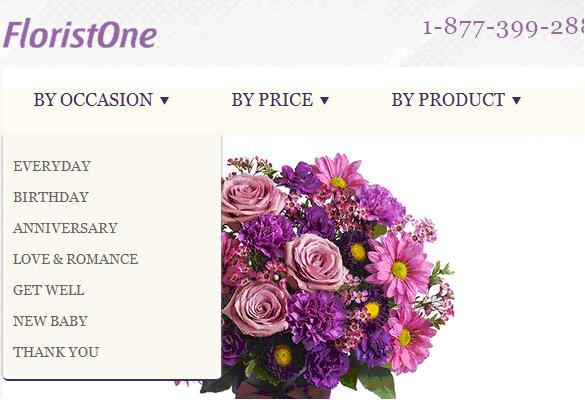
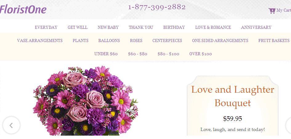
It looked great but it performed terribly. We were creating work for the visitor because each time they wanted to see a different category, they had to mouse over the “By Occasion” and then move the mouse down and click on the occasion they wanted. We solved this by doing what our 1999 site did: display all the categories and other navigation choices so they could be seen all at once and easily clicked on.
Hover menus can do more harm than good and they certainly did not work for us as an ecommerce site where we need to make things easy for our visitors.
Pagination Links Help Visitors Continue Shopping
In our Redesign, our Occasion pages left out a pagination system which had numbered links to more pages of products in that category.
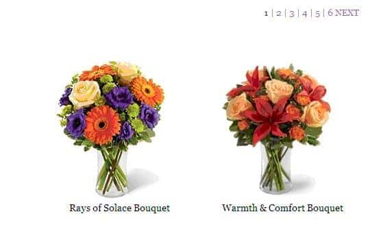
Previously analytics testing on our 1999 site had shown that these pagination links were highly used. When visitors don’t find what they are looking for, they can keep clicking these pagination links which we located in two places – above the products on the right and centered below the products. By removing these pagination links, once again, we made it harder for visitors to find something they were happy with and they left our site more quickly. This was evidenced by our pages view per visit being down on Redesign.
Making it Easy To Add an Item to the Shopping Cart
Our Redesign category pages also had a single “View Item” page under each product that took the visitor to the product detail page. Our more successful 1999 site had both an ‘Info’ and a ‘Buy’ button.

‘Info’ takes you to the product detail page, ‘Buy’ puts the product directly into your Shopping Cart and allows you to proceed to Checkout. Allowing visitors to put something in their cart in a single click without having to go to the product detail page makes using our site fast, efficient and less irritating especially to those most important visitors who are settling into the work of selecting and picking a product to buy.
Reminding Visitors What They Liked
Somehow, our Redesign even missed having our ‘My Recently Viewed Items’ section which appears at the bottom of our category pages

Visitors are clicking and viewing products on your site, they need to be reminded of products they looked at previously and may have liked initially but forgot about. A reminder and a second look at a product can be the difference between a visitor and a customer.
When we identified these missing features and website functionality in Redesign, we chose not to add each one back at a time but instead put many changes back in all at once. We traded knowing the specific effect of each change we were making and instead focused on the overall goal of having Redesign outperform 1999 – which had taken long enough. And as we put these changes in, Redesign came closer and closer to 1999, first down 25% and then 15%.
We also called the this section “My Recently Viewed Items” over “Recently Viewed Items” to allow the visitor to create an attachment to the process. Many seemingly small things like this can boost online sales.
These were some the larger issues but there were many similar but smaller features like this we needed to fix or put in place on Redesign.
Redesign also used JavaScript and CSS heavily and part of the conversion journey for us was identifying an fixing issues with those technology issues in different browsers.
After many, many change and many experiments, we had Redesign converting at 15% better than 1999. Our conversions lay in the details, very important details.
Google Analytics, Its Shortcomings and Building our Own In-House Analytics
Google Analytics is what we started our testing with but it is not what we finished with. Google Analytics is free to use, has a plethora of features, and is widely used and understood by most analytics consulting firms (including the three we used during the course of our testing). But it also disappointed us in that it did not give us surety in the things we needed to know and cared about most.
In Google Analytics, you set up ‘Experiments’ and you can also setup separately ‘Funnel Visualization’. Funnel Visualization lets you see conversion rates down the individual steps of the Checkout process which is also called the funnel. But Experiment and Funnel Visualization should both have tracked the same amount of sales. We found it terribly frustrating when these sales numbers did not match up between Experiments and Funnel Visualization and this created doubt which was not good.
Sales figures from Google Analytics did also not have an exact match to sales totals from our database and this left us wondering some more. Google Analytics is also not real-time in that when a when a sale is made it is not immediately reflected in Google Analytics.
This was all enough to tell us we needed to a different analytics solution. We did not mind paying for a solution but did not feel like getting familiar with another application and most of our analytics experts primarily used Google Analytics. So we built our own in-house analytics tracking system. Building our own system was made easier in that there only four things we really needed to measure: bounce rate, number of pages viewed per visit, time on site, and most importantly, sales conversion rate.
We set some cookies in our visitors sessions, created a few database tables to store the user activity, created a basic reporting interface and away we were. It was not quite that easy but with a few tweaks and after fixing a few bugs, we did have an in-house analytics system that allowed us to A/B testing and most importantly, be 100% sure in what we were seeing. And analytics numbers matched up with our sales numbers from our database.
It is not our recommendation that everyone build their own in-house analytics system but we do feel that you have to have total trust and be comfortable with the analytics tool you are using along with the person or firm that is setting up experiments for you. Doubt in any of this is a killer and it does not give you the confidence you need to make a big decision like implementing the Redesign of a website.
What We Learned and Going Forward
A pretty, modern website won’t translate into sales unless it has the functionality and features to make things easy for visitors to stay on the site and buy something. It was amazing to us that a 1999 website can vastly outperform a new, modern website that is not well designed. We are proud of our 1999 website – it was built with the visitor in mind, it converted fantastically well and it and lasted us 15 years.
Trusting and being sure in your analytics tools, the expert you are using, and the data that is being accumulated is key. Without trust and confidence, important decisions can’t be made.
Let experiments run long enough. Early on, an experiment can lean heavily one way only to be corrected as an adequate amount of data comes in. There is a tendency to read too much in to early results.
Getting our Redesign effort to work like it should involved paying attention to a lot of important details and then making many changes to address what we were noticing. The idea of continuous improvement or kaizen comes to mind and the process reminded us of the need for us to continually improve in all areas. This will last beyond our Redesign efforts.
Armed with our in-house analytics system, we will be committed to trying, testing and measuring new features. We are planning a real-time popularity system for products that is continually refined by user purchases and site interaction. Our Redesign did come with a few different colour schemes and we will be testing the effect of colours on purchase habits. We will be working on improving site speed as site speed impact on ecommerce can be dramatic.
So now that is no longer 1999 at Florist One, we’re feeling better about ourselves. We had actually held off trying to recruit a few new affiliate potentials until the new website was in place – now we can proceed with those efforts.
Our Redesign took way longer than it should have but it taught us a lot about what was important and what worked on our website. The process gave us a path, tools and insight to move forward and we also got some cool business cards to match the new site.